Xively by LogMeIn
Xively is an IoT platform that enables businesses to connect different devices and operations to the internet. By offering a wide scale of services and ready-made infrastructure, Xively helps businesses in any industry to launch connected products and get it to the customers.
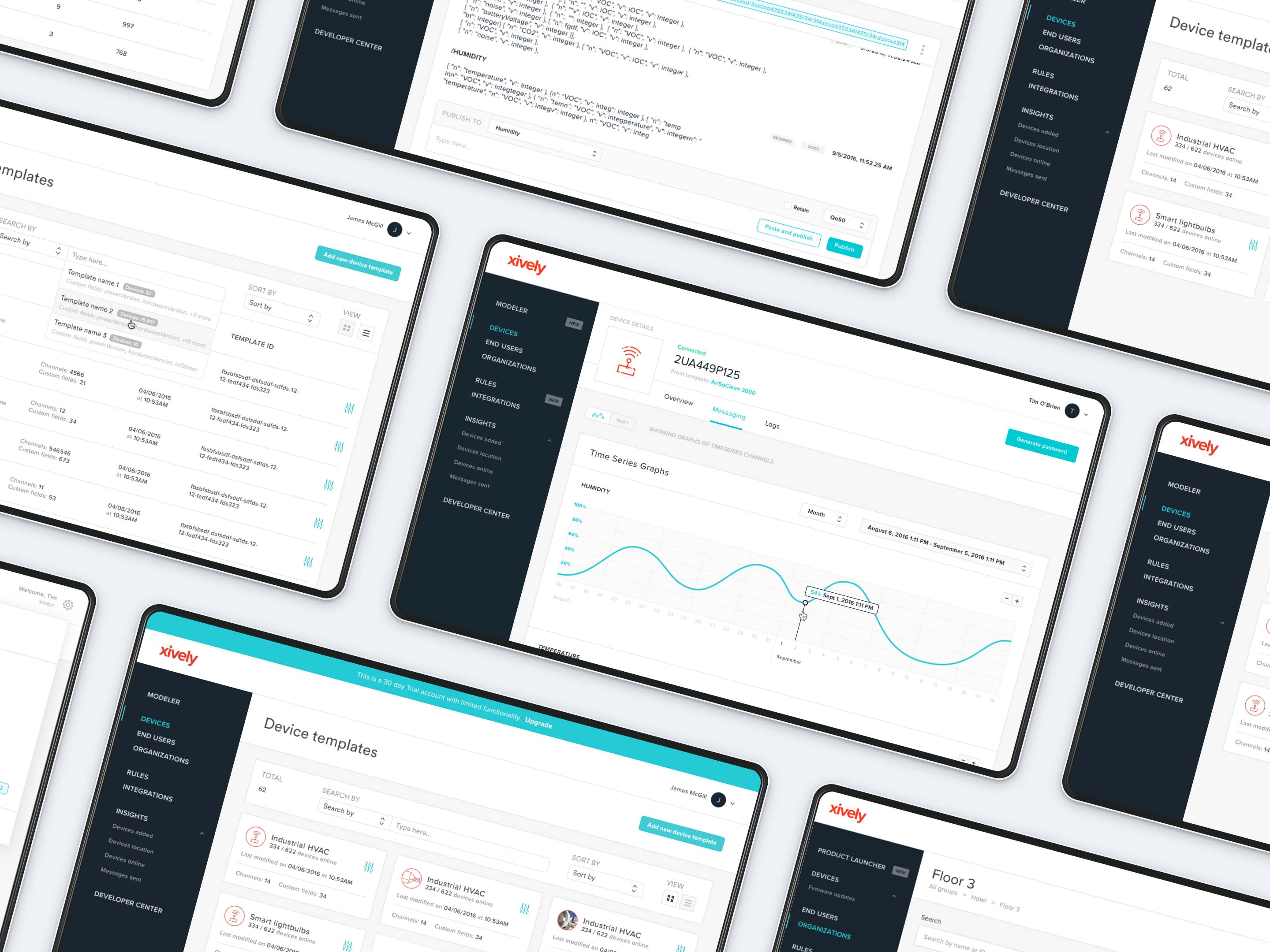
Project overview
I had been working at UX Studio for a couple of months when I had the opportunity to become a member of an amazing UX team at LogMeIn, one of our long-term clients. It was different from our regular projects: I became a member of the internal design team and spent most of my time at the LogMeIn office. It was like being employed by them, except I still had some company related tasks and attended our weekly meetings at UX Studio.
During the 6 months I spent working on Xively I was fortunate enough to both improve existing features and work on completely new concepts. I learned a lot about how big companies work and got familiar with LogMeIn's design process, which I found very exciting. I enjoyed being a member of an international team and working in a real agile environment.
My role
The Xively design team consisted of a UX lead, four designers and a researcher, but we were in daily contact with the product owners and the developers too. Three of us were in Budapest, but half of the team was in Boston, which made the communication somewhat challenging. Because of the different time zones we only had 2 hours a day when we could work together in real time.
My contribution
Login flow redesign
When introducing two-factor authentication to Xively, we had to make sure our users would find the login process easy-to-understand. I was in charge of redesigning the login flow and adding two-factor authentication to it.
I collected the best practices, made some paper sketches about my ideas and asked for feedback. I put together a prototype to test and after a few iterations the new login flow was ready. I designed all the interactions and created a detailed animation of the flow in Principle to make things easier for the developers.
A part of the login flow amination I created
Introducing Groups
Organizations were containers of devices, end users and sub-organizations, but the connection among these elements wasn’t always easy to discover, since we didn’t have an interface where our users could get a good overview with all the details. In an organization you could see only sub-organizations, and if you wanted to see other details, like what devices were in that sub-org and what users had permission to them, you had to navigate to the details page of each item separately.
I was having long conversations about this problem with Fraser, one of the product managers. We were very enthusiastic, and after a few sessions we finally had a concept in mind.
“Could we handle them as folders? Users are already familiar with folder sturctures, so they’re going to know how to interact with them.”
After the idea was born, I created the first prototype. It took many weeks of iterations, but at the end we had an exciting new feature that helped our users to get a nice overview of their nested groups, devices and end users.
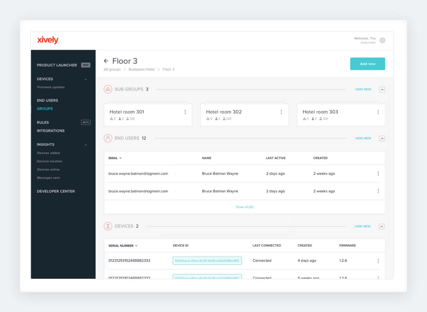
Group hierarchies in Xively
Based on user feedback we also renamed this section from Organizations to Groups, which was a better fit for this new concept. If you want to read more about it, you can check the documentation in Xively Developer Center.
New navigation
Xively’s navigation was messy, users weren’t always able to find what they wanted, so we decided to take the sidebar items to pieces and reorganize them in a way that makes more sense to the users. We carried out a card sorting research, which was very helpful and we got many new ideas.
Based on the results we realized that — for example — we needed to move the user and account settings to a separated area instead of having them in the side navigation.
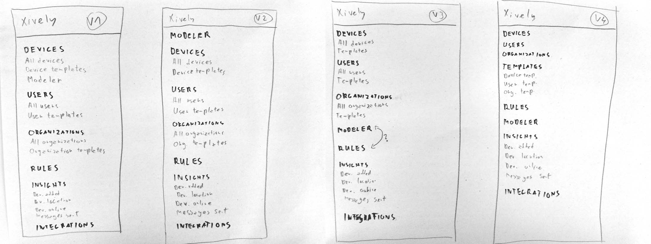
First sketches of the new side navigation
We also made some copy adjustments: we changed Users to End users for clarity across the platform. (We had to differentiate Xively users – our clients – from third party end users – our clients' clients.)
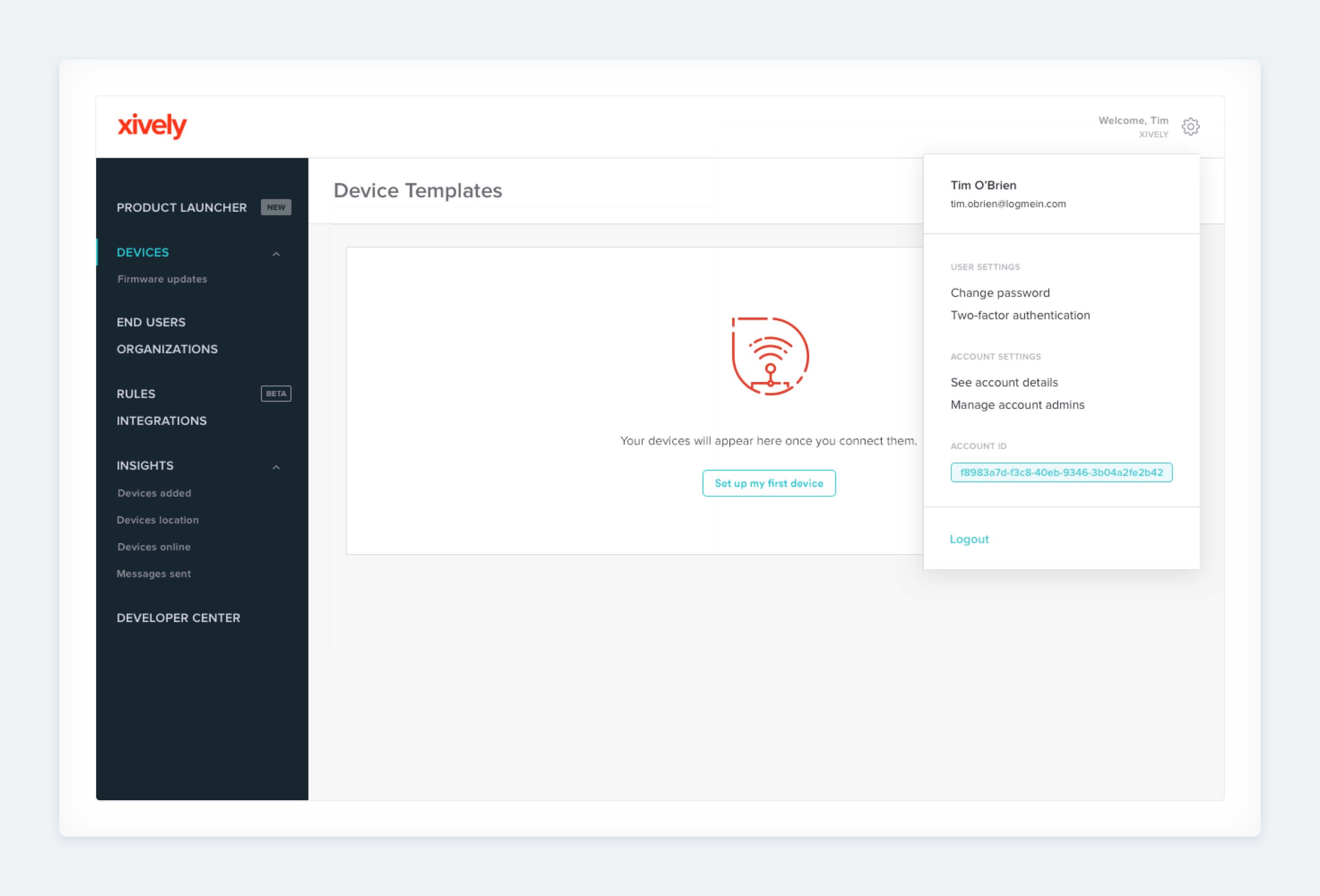
The new sidebar and the settings section in the upper-right corner
Product Launcher
Sometimes it was quite difficult and time-consuming to make potential customers understand the concept behind the connected product management. We wanted them to see what Xively is capable of and how things are connected to each other.
This is why we came up with the idea of the Product Launcher, a tool that lets you create and connect virtual devices to the platform. It gives you a nice visual overview of your product data, sensors and rules. What’s more, it helps you understand what the end users would see and how they would interact with your product in a mobile app.
I was responsible for creating the onboarding flow for the Product Launcer. I created an Axure RP prototype that we tested in many iterations. The best solution turned out to be a guided tour to show the user around and introduce them to the basic features. The flow was customisable by our users according to what they were the most interested in.
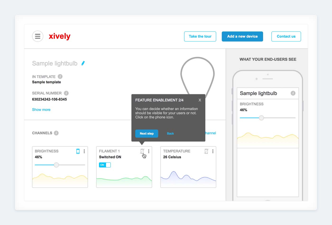
A screen from the Axure prototype I created to test the onboarding flow
The Product Launcher became the number one tool for helping potential customers understand what Xively is about.
In the later phases the Boston team was responsible for the Product Launcher, but we still had common brainstorming and design review sessions, and I could also create some animations, such as the one below.
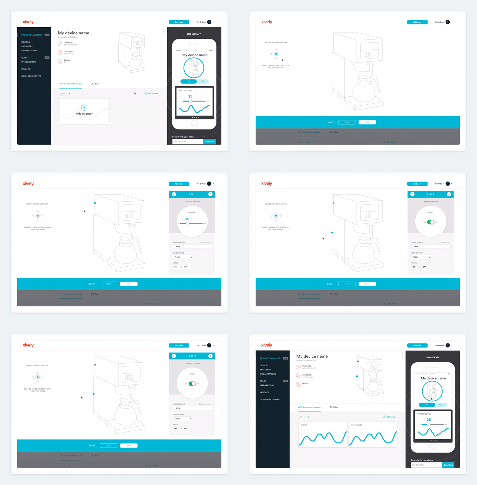
Adding sensors to a device — an animation I created with Principle app
Design system
We realized that the bigger the team and the product were, the more important it was to have a design system that works well. This is why we started to build a massive kit in which we had colours, icons, typography, sizes, paddings and other UI principles. We created ready-to-use components like buttons, links, tabs, forms, modals, graphs, alerts, headers, cards, etc. and combined them into templates to show the relationship among the elements.
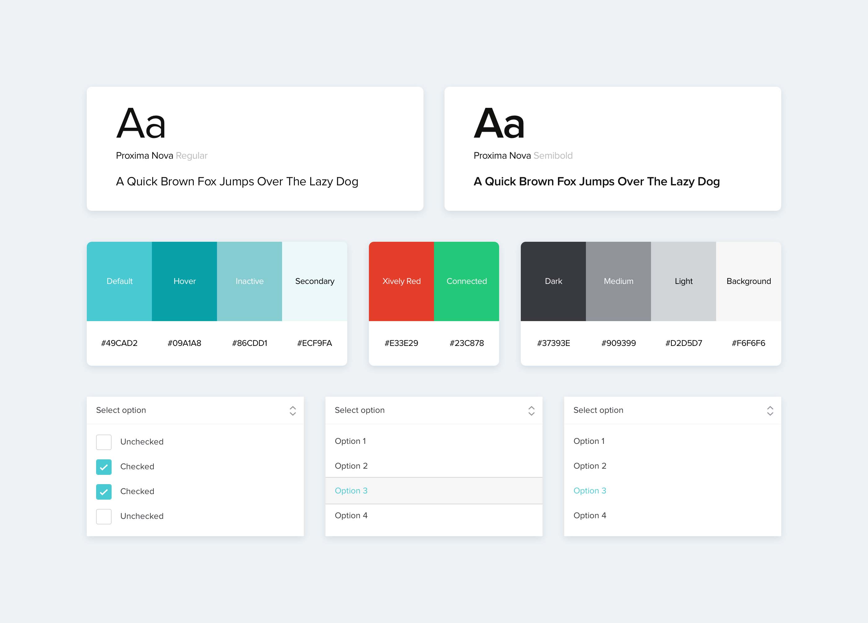
UI bits in the Xively Design System
We also laid the foundations of how the design team should work: how we make decisions, what to do with new ideas, how to communicate with the developers, what software we use, etc.
Improved readability
After some of our users had complained about readability issues, we decided to do something about it. I did deep research on the topic and learned a lot about colour and contrast ratios. I got to know the Web Content Accessibility Guidelines 2.0 and started to work on the issues so that Xively could meet the expectations.
I conducted a short study to sum up my findings and presented to the whole team. Soon we could start working on the issue along with some of the developers.
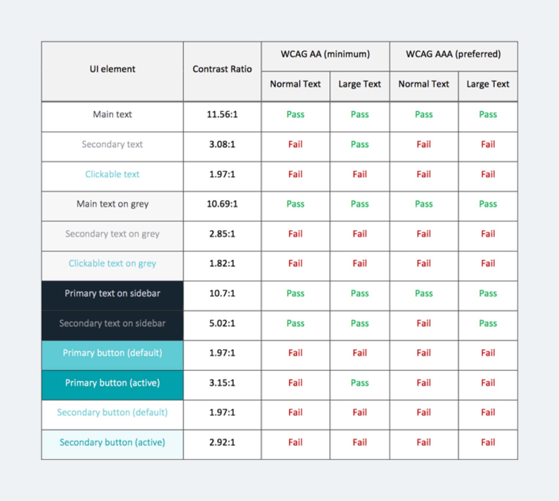
Contrast check results — A table from the readability study I created
LogMeIn Hackathon
Hackathon is an awesome event at LogMeIn. It’s an innovation lab, where you can team up with anyone and work on anything you want for a whole week. At the end of the week you need to do a presentation about your product idea in 3 minutes in front of a professional committee. It’s very exciting, like a startup pitch.
I was fortunate to be in a team with some very talented engineers during Hackathon 2016. We not only came up with a product idea and created a beta version, but figured out why it would be feasible from a business perspective. At the end of the week we had a presentation day, when we presented our idea along with about 60 other teams.
The time pressure made working on our idea challenging, but it was also super exciting, because we had the opportunity to work on something new.
Takeaways
Working in a big organization
I hadn’t had any experience with global organizations before I started working at LogMeIn. The first couple of months were extremely challenging for me: not only I had to learn about a new industry and understand a complex product but I also had to find out how to navigate in such a large corporate environment. My lack of technical knowledge also didn't make all this any easier.
But thanks to these challenges, I learned so much. I gained some basic technical skills, just enough to not feel lost in conversations with our developers. I learned how to navigate in a complex environment as well as taking many perspectives into consideration when making design decisions.
I loved how helpful everyone in the company was when I needed help with something and how easy it was to find people with all kinds of skills right within the organization.
International design team
In spite of the time difference, we managed to work together with the Boston team very well. We distributed the tasks in a reasonable way and we usually had common workshops. I found the communication challenging in the beginning, but it helped me improve my time management skills after all. I learned a lot about user interface principles, and got countless useful tips from other designers. It was really an amazing period of my life.
Thank you for reading!